SEOhub 簡介
本文件將幫助您了解 SEOhub 模板的結構,並指導您執行常見功能。
注意:我們不會回應項目評論區或電子郵件中的任何支援問題。如果本文檔未能解答您的問題,請隨時在 我們的支援論壇
上開設私人票證。 我們的支援論壇
Potenza Global Solutions 如果您想自訂,請在此處與我們聯絡:
安裝
作者:
- 請依照以下步驟開始使用您的網站模板:
... /Template開啟 - 資料夾以尋找所有模板檔案
- 您需要透過 FTP 將這些檔案上傳到您的網頁伺服器,才能在您的網站上使用。
files/folders請確保您上傳了所需的css檔案,如下所示:fonts– 樣式表資料夾images– 字體資料夾js– 圖片資料夾php– Javacripts 資料夾revolution– php 資料夾index-1.html– Revolution slider 所有檔案
– (以及您想要的所有 HTML 檔案)
- 其他檔案可依您的偏好使用。
您現在一切就緒了!開始新增您的內容,並以時尚的方式展示您全新美麗的網站。
基本模板結構 以了解更多關於 Bootstrap 的資訊。本模板採用響應式佈局,並基於 Bootstrap V3+ 框架 。Bootstrap 是網路上開發響應式、行動優先專案最受歡迎的 HTML、CSS 和 JS 框架。
點擊此處
HTML結構 模板的整體 HTML 結構都相同。這是
<!DOCTYPE html>
<html lang="en">

  <head>
    [Page meta, page css, page title etc...]
  </head>

  <body>

  <!-- preloader -->
  <div id="loading"> [LOADER CONTENT] </div>
  <!--preloader -->

  <!--header -->
  <header id="header" class="">
  <div class="topbar">
    [TOP BAR CONTENT]
  </div>

  <div class="menu">
    <nav id="menu" class="mega-menu">
      [MENU CONTENT]
    </nav>
  </div>
  </header>
  <!--header -->

  <!--Slider- -->
  <section class="rev_slider_wrapper">
    [SLIDER CONTENT]
  </section>
  <!--Slider -->

  <!--Section 1 -->
  <section>
    [SECTION 1 CONTENT]
  </section>
  <!--Section 1 -->

  <!--Section 2 -->
  <section>
    [SECTION 2 CONTENT]
  </section>
  <!--Section 2 -->

  <!--footer -->
  <footer class="footer">
    [FOOTER_CONTENT]
  </footer>
  <!--footer -->

  <div class="back-to-top">
    [BACK TO TOP CONTENT]
  </div>

  [PAGE JAVASCRIPTS HERE]

  </body>
</html>
模板的通用 HTML 結構:
CSS結構 模板的整體 CSS 結構都相同。這是
<!-- Favicon -->
<link rel="shortcut icon" href="images/favicon.ico" />
<!-- bootstrap -->
<link rel="stylesheet" type="text/css" href="css/bootstrap.min.css" /
<!-- mega menu -->
<link rel="stylesheet" type="text/css" href="css/mega-menu/mega_menu.css" />
<!-- font awesome -->
<link rel="stylesheet" type="text/css" href="css/font-awesome.min.css" />
<!-- Themify icons -->
<link rel="stylesheet" type="text/css" href="css/themify-icons.css" />
<!-- owl-carousel -->
<link rel="stylesheet" type="text/css" href="css/owl-carousel/owl.carousel.css" />
<!-- revolution -->
<link rel="stylesheet" type="text/css" href="revolution/css/settings.css" />
<!-- main style -->
<link rel="stylesheet" type="text/css" href="css/style.css" />
<!-- Responsive -->
<link rel="stylesheet" type="text/css" href="css/responsive.css" />
模板的通用 CSS 結構:
Javascript結構 模板的整體 Javascript 結構都相同。這是
<!-- jquery  -->
<script type="text/javascript" src="js/jquery.min.js"></script>
<!-- bootstrap -->
<script type="text/javascript" src="js/bootstrap.min.js"></script>
<!-- mega-menu -->
<script type="text/javascript" src="js/mega-menu/mega_menu.js"></script>
<!-- owl-carousel -->
<script type="text/javascript" src="js/owl-carousel/owl.carousel.min.js"></script>
<!-- magnific-popup -->
<script type="text/javascript" src="js/magnific-popup/jquery.magnific-popup.min.js"></script>
<!-- appear -->
<script type="text/javascript" src="js/jquery.appear.js"></script>
<!-- counter -->
<script type="text/javascript" src="js/counter/jquery.countTo.js"></script>
<!-- custom -->
<script type="text/javascript" src="js/custom.js"></script>
編譯Sass
模板的通用 Javascript 結構:
概覽
Sass 可能是最受歡迎的 CSS 預處理器;多年來,它幫助我們編寫乾淨、可重複使用且模組化的 CSS。在這個快速教學中,我將直接切入重點,並說明如何使用命令列將 Sass 編譯成 CSS。
安裝 Node.js ,開啟套件並依照精靈指示操作。若要透過命令列編譯 Sass,我們首先需要安裝 nodejs.org。從官方網站下載
初始化 NPM
NPM 是 JavaScript 的 Node 套件管理器。NPM 可輕鬆安裝和解除安裝第三方套件。若要使用 NPM 初始化 Sass 專案,請開啟您的終端機並 CD (變更目錄) 到您的專案資料夾。
進入正確的資料夾後,執行命令 npm init。系統會提示您回答有關專案的幾個問題,之後 NPM 會在您的資料夾中產生一個 package.json 檔案。
安裝 Node-Sass
Node-sass 是一個 NPM 套件,可將 Sass 編譯成 CSS (而且速度非常快)。若要安裝 node-sass,請在您的終端機中執行以下命令: npm install node-sass
一切準備就緒,可以編寫一個小腳本來編譯 Sass。在程式碼編輯器中開啟 檔案。您會看到類似以下的內容: 在
{
  "name": "sass-demo",
  "version": "1.0.0",
  "description": "",
  "main": "index.js",
  "scripts": {
    "test": "echo \"Error: no test specified\" && exit 1"
  },
  "author": "",
  "license": "ISC"
}
區塊中新增一個 scripts 命令,在 scss 命令下方,如下所示: test 讓我們逐字解析這行。
"scripts": {
  "test": "echo \"Error: no test specified\" && exit 1",
  "scss": "node-sass --watch scss -o css"
}
:指的是 node-sass 套件。
node-sass:一個可選的旗標,表示「監控--watch資料夾中的所有 :我們編譯好的 CSS 的輸出資料夾。 檔案,並在每次變更時重新編譯它們。」 執行腳本 :我們放置所有 .scss 檔案的資料夾名稱。scss若要執行我們的一行腳本,我們需要在終端機中執行以下命令:-o css太棒了!
我們正在監控和編譯 SASS。
Favicon 是與 URL 相關聯的圖示,顯示在各種位置,例如瀏覽器的位址列或書籤清單中的網站名稱旁邊。 npm run scss
您可以使用以下程式碼為您的網站新增 Favicon: 頁面載入過場動畫
網站圖標
頁面載入過場動畫預設為啟用。如果您想停用頁面載入過場動畫,只需刪除以下區塊即可。
您可以透過將 loader.gif 替換為圖片資料夾中的 loader.gif 檔案來更新載入動畫。
<link rel="shortcut icon" href="images/favicon.ico"/>
標誌容器位於頁頭容器中 –
。替換
<div id="loading">
  <div id="loading-center">
    <img src="images/loader.gif" alt="">
  </div>
</div>
為您自己的標誌圖片 URL。
標誌設定
標誌的預設高度為 40px。您可以根據您的標誌類型和需求設定高度。 #header注意 "logo.png" 您可以立即變更您網站的配色方案。有 2 種非常簡單的方法可以變更您網站的顏色。
<ul class="menu-logo">
  <li>
    <a href="index.html"><img id="logo_img" src="images/logo.png" alt="logo"> </a>
  </li>
</ul>
中包含即可。 您只需包含一個現有的配色方案,然後在
配色方案
請參閱以下範例:
選項 2: 選項 1: (css/skins/skin-yourcolor.css) 變更 head 中的顏色代碼
<link href="css/skins/skin-blue.css" rel="stylesheet" type="text/css" />
您可以從 更改字體樣式 css/skins/skin-defult.css 變更 head 中的顏色代碼
<link href="css/skins/skin-defult.css" rel="stylesheet" type="text/css" />
中的所有字體中新增/變更網站字體,選擇最適合您的字體。您可以在
資料夾中 或新增一個 檔案的頂部找到字體代碼: style.css Google Web Font 服務, CSS 若要包含新字體,您可以簡單地新增另一行,如下所示:
@import url('https://fonts.googleapis.com/css?family=Lato:300,300i,400,400i,700,700i,900|Montserrat:400,700'); 分隔符並貼上
@import url('https://fonts.googleapis.com/css?family=Lato:300,300i,400,400i,700,700i,900|Montserrat:400,700');
@import url(https://fonts.googleapis.com/css?family=Open+Sans:400,300,600,800,700,300italic,400italic,600italic,700italic,800italic);
在預設網站字體連結之後。 | 為了變更字體,如果您打算使用 Google 字體,您需要編輯上述連結為您的自訂字體,或將其完全移除。如果您打算使用自行託管的字體,以下是一個使用 Roboto:400,300,800,700,600 的範例。
頁頭
輔助類別
我們為您建立了一些非常有用的輔助類別。這些類別可協助您快速定位元素,而無需編寫新的 CSS 規則。這些類別是 CSS 頁面中預定義的通用輔助類別,以下是它們能做什麼的快速概覽:
頁面區塊間距
您可以將此輔助類別新增到設定區塊 padding top 80px 和 padding bottom 80px.
新增 page-section-ptb 類別到 section 標籤。請參閱以下範例:
<section class="... page-section-ptb">
   [YOUR CONTENT]
</section>
中包含即可。 使用此輔助類別來維護所有頁面區塊的間距。您也可以使用 page-section-pt 僅用於頂部間距,而 page-section-pb 僅用於底部間距。
區塊標題
您可以使用此程式碼來維護您的頁面區塊標題樣式。
<div class="section-title">
  <span class="text-white">Section title's sub title</span>
  <h2 class="text-white">Section title </h2>
  <div class="separator"></div>
</div>
文字顏色
您可以在文字中使用顏色。只需新增 .text-blue (或任何您想要的顏色) 類別到您想使用的位置。請參閱以下範例:
<div class="text-blue">
  [YOUR TEXT CONTENT]
</div>
中包含即可。 我們的模板中包含 4 個顏色輔助類別 text-blue, text-white, text-black 和 text-gray。您可以根據您的需求新增無限數量的顏色類別。
背景顏色
您可以在背景中使用顏色。只需新增 .blue-bg (或任何您想要的顏色) 類別到您想使用的位置。請參閱以下範例:
<div class="blue-bg">
  [YOUR CONTENT]
</div>
中包含即可。 我們的模板中包含 4 個背景顏色輔助類別 blue-bg, white-bg, dark-gray-bg and gray-bg 。您可以根據您的需求新增無限數量的背景顏色類別。
背景圖片
背景
您只需在 div 標籤中新增 InlineStyle 即可在背景中使用具有視差效果的圖片,並透過使用此功能來建立您自己的背景。請參閱以下範例:
<div style="background-image:url(Path); ">
  [YOUR CONTENT]
</div>
如果您的背景很小,並且您想使用重複的背景,則使用樣式屬性 background-repeat 並設定值 repeat 或 no-repeat. 請參閱以下範例:
<div style="background-image:url(Path); background-repeat:no-repeat;">
  [YOUR CONTENT]
</div>
如果您想使用您的背景作為封面或容器,只需新增樣式屬性 background-size 並設定值 cover 或 cointainer. 請參閱以下範例:
<div style="background-image:url(Path); background-size:cover;">
  [YOUR CONTENT]
</div>
背景疊加
您可以將此 .bg-overlay-black-10 類別新增到您的 HTML 代碼中的任何元素,以在任何圖片或任何區塊上套用疊加顏色。請參閱以下範例:
<div class="bg-overlay-black-10">
  [YOUR CONTENT]
</div>
以下是一些您可以使用的預定義疊加類別:
| 類別 | 說明 | 類別 | 說明 |
|---|---|---|---|
.bg-overlay-black-10 | 表示套用黑色疊加,疊加度為 0.10 | .bg-overlay-black-20 | 表示套用黑色疊加,疊加度為 0.20 |
.bg-overlay-black-30 | 表示套用黑色疊加,疊加度為 0.30 | .bg-overlay-black-40 | 表示套用黑色疊加,疊加度為 0.40 |
.bg-overlay-black-50 | 表示套用黑色疊加,疊加度為 0.50 | .bg-overlay-black-60 | 表示套用黑色疊加,疊加度為 0.60 |
.bg-overlay-black-70 | 表示套用黑色疊加,疊加度為 0.70 | .bg-overlay-black-80 | 表示套用黑色疊加,疊加度為 0.80 |
.bg-overlay-black-90 | 表示套用黑色疊加,疊加度為 0.90 | ||
.bg-overlay-white-10 | 表示套用白色疊加,疊加度為 0.10 | .bg-overlay-white-20 | 表示套用白色疊加,疊加度為 0.20 |
.bg-overlay-white-30 | 表示套用白色疊加,疊加度為 0.30 | .bg-overlay-white-40 | 表示套用白色疊加,疊加度為 0.40 |
.bg-overlay-white-50 | 表示套用白色疊加,疊加度為 0.50 | .bg-overlay-white-60 | which means apply white color overlay with 0.60 overlay |
.bg-overlay-white-70 | which means apply white color overlay with 0.70 overlay | .bg-overlay-white-80 | which means apply white color overlay with 0.80 overlay |
.bg-overlay-white-90 | which means apply white color overlay with 0.90 overlay |
中包含即可。 You can create your own helper classes by creating the class in the stylesheet as per your requirement. This helper class only support RGBA color values.
文字對齊
You can add this helper class to any element in your HTML code to set text-align
| 類別 | 說明 |
|---|---|
.text-left | which means text-align: left; |
.text-right | which means text-align: right; |
.text-center | which means text-align: center; |
分隔線
You can add this helper class to any element in your HTML code to add Separator line. Simply add hr tag where you want to add the line. See example below:
...
  [SECTION 1 CONTENT]
...
</section> <!--Section 1 End-->
  <hr/>
<section> <!--Section 2 Start-->
...
  [SECTION 2 CONTENT]
...
標籤
You can add this helper class to any element in your HTML code to make a label. Simply add label 和 label-danger (or any given below) class where you want to add a label. See example below:
<span class="label label-danger">Label name</span>
Here are some default labels you can use or you can make your own label as per your requirement.
| 類別 | 說明 | Result |
|---|---|---|
.label-default | Default label | Default |
.label-primary | Primary label | Primary |
.label-success | Success label | Success |
.label-info | Info label | Info |
.label-warning | Warning label | Warning |
.label-danger | Danger label | Danger |
滑桿
We include 3 different sliders for you to be used on any Page with 100s of Options. List of the Sliders included are mentioned as follows:
- Revolution
- Owl carousel
Revolution
Revolution Slider is a premium plugin, an awesome animated slider that creates eye-catching sliders.
Please find the full online Revolution Slider documentation.
中包含即可。
To load Revolution slider locally we included below js in all home pages. You can remove it when you upload the files to your web server. You don’t need these js files to load slider on live server. If you remove these js your slider will not work locally.
<!-- SLIDER REVOLUTION 5.0 EXTENSIONS
(Load Extensions only on Local File Systems !
The following part can be removed on Server for On Demand Loading) -->
<script type="text/javascript" src="revolution/js/extensions/revolution.extension.actions.min.js"></script>
<script type="text/javascript" src="revolution/js/extensions/revolution.extension.carousel.min.js"></script>
<script type="text/javascript" src="revolution/js/extensions/revolution.extension.kenburn.min.js"></script>
<script type="text/javascript" src="revolution/js/extensions/revolution.extension.layeranimation.min.js"></script>
<script type="text/javascript" src="revolution/js/extensions/revolution.extension.migration.min.js"></script>
<script type="text/javascript" src="revolution/js/extensions/revolution.extension.navigation.min.js"></script>
<script type="text/javascript" src="revolution/js/extensions/revolution.extension.parallax.min.js"></script>
<script type="text/javascript" src="revolution/js/extensions/revolution.extension.slideanims.min.js"></script>
<script type="text/javascript" src="revolution/js/extensions/revolution.extension.video.min.js"></script>
Owl carousel
This excellent carousel slider can be controlled using HTML5 data attributes.
Find the full online owl carousel Slider documentation.
短代碼
Shortcodes are reusable elements. They can be used anywhere on any page by simply copy/paste. Setting up shortcodes is very easy & self-explanatory. Here is the list of Shortcodes included with SEOhub:
- 分頁
- accordion
- 區塊
- 計數器
- 聯絡表單
- Google地圖
- 字體圖標
- Bootstrap網格
分頁
Use the below code to display Tabs:.
<!-- Nav tabs -->
<ul class="nav nav-tabs" role="tablist">
  <li role="presentation" class="active">
    <a href="#tab-00" aria-controls="tab-00" role="tab" data-toggle="tab">
      [ Tab1 Title ]
    </a>
  </li>
  <li role="presentation">
    <a href="#tab-01" aria-controls="tab-01" role="tab" data-toggle="tab">
      [ Tab2 Title ]
    </a>
  </li>
</ul>

<!-- Tab panes -->
<div class="tab-content">
  <div role="tabpanel" class="tab-pane active" id="tab-00">
    [ Tab1 Description ]
  </div>
  <div role="tabpanel" class="tab-pane fade" id="tab-01">
    [ Tab2 Description ]
  </div>
</div>
中包含即可。 Make sure you use unique IDs for each Tab Items and Tab Container.
手風琴
Use the below code to display accordion:
<div class="accordion">
  <div class="acd-group">
    <a href="#" class="acd-heading">
      [ Accordation Name ]
    </a>
    <div class="acd-des">
      [ Description ]
    </div>
  </div>
</div>
There Are 3 types of accordion styles like With icon , Without icon , simple with text big 和 with icon bg style.
區塊
.container element.<section class="your-section-title">
<div class="container">
<div class="row">
[ YOUR SECTION HERE ]
</div>
</div>
</section> 計數器
You can add Counter on the scroll to any Page, use below code to display Counter:
<section class="counter">
  <div class="container">
    <div class="row">
      <div class="col-sm-12">
        <div class="counter-block">
          <span class="ti-cloud-up"></span>
          <b class="timer mt-30 mb-30" data-to="3968" data-speed="10000">[ Your Counter Number ]</b> //data-to means that your counter moves upto your typing number
          <h6 class="text-white">[ YOUR CONTENT ]</h6>
        </div>
      </div>
    </div>
  </div>
</section>
中包含即可。 You can set your counter data in data-to="3968" and set your data speed in data-speed="10000". The default data speed is 10000.
聯絡表單
Contact form as main part of Contact section, the only thing you need to do is to setup your email address.
To configure your email just go to PHP folder and open both php file contact-form.php 和 ajax-form.php, then replace [email protected] with your email address. That’s it!
中的顏色代碼
$to = '[email protected]'; // Recipient's email address
中包含即可。 Please find [email protected] and replace demo email with your email.
Google地圖
You can add Embedded Google Maps to any Page using the following setup:
- 1: Go to Google地圖 and Find your location.
- 2: Go to
Menufrom left-bar and click onShare or embed map. - 3: Select
Embed map& then copyiframe. - 4: Paste
iframeinto your HTML code.
Sample example of google map iframe:
<!--=============  contact-map  -->
<section class="contact-map">
  <div class="container-fluid">
    <iframe src="https://www.google.com/maps/embed?pb=!1m18!1m12!1m3!1d3151.8351288872545!2d144.9556518!3d-37.8173306!2m3!1f0!2f0!3f0!3m2!1i1024!2i768!4f13.1!3m3!1m2!1s0x6ad65d4c2b349649%3A0xb6899234e561db11!2sEnvato!5e0!3m2!1sen!2sin!4v1443621171568" width="100%" height="450" frameborder="0" style="border:0" allowfullscreen>
    </iframe>
  </div>
</section>
<!--=============  contact-map  -->
中包含即可。 Remove width, height and style from the iframe. If you want to change it you can change it in CSS from style.css as per your requirement. For more information please visit Google map documentation.
字體圖標
We have included Font awesome and themify icons in our template.
1: Font awesome:
You can place Font Awesome icons just about anywhere using the CSS Prefix fa and the icon’s name. Font Awesome is designed to be used with inline elements (we like the < i > tag for brevity, but using a < span > is more semantically correct). See example below:
<i class="fa fa-camera-retro"></i>
中包含即可。 add font-awesome css in head tag after bootstrap.min.css. See example below::
<head>
  [HEADER TAG]
<!-- bootstrap -->
<link href="css/bootstrap.min.css" rel="stylesheet" type="text/css" />
<!-- Font awesome -->
<link href="css/font-awesome.css" rel="stylesheet" type="text/css" />
</head>
2: Themify icons:
You can place themify-icons just about anywhere using the icon’s class name. themify-icons is designed to be used with inline elements we like the < i > tag for brevity. See example below:
<i class="ti-arrow-up"></i>
中包含即可。 新增 themify-icons.css in head tag after bootstrap.min.css. See example below:
<head>
  [HEADER TAG]
<!-- bootstrap -->
<link href="css/bootstrap.min.css" rel="stylesheet" type="text/css" />
<!-- Themify icons -->
<link href="css/themify-icons.css" rel="stylesheet" type="text/css" />
</head>
中包含即可。 You must have to place any font-icon file into fonts folder. (e.g. – If you’ve font-awesome font so you need to put into fonts folder.
Bootstrap網格
Grid systems are used for creating page layouts through a series of rows and columns that house your content.
<div class="row">
  <div class="col-md-1">.col-md-1</div>
  <div class="col-md-1">.col-md-1</div>
  <div class="col-md-1">.col-md-1</div>
  <div class="col-md-1">.col-md-1</div>
  <div class="col-md-1">.col-md-1</div>
  <div class="col-md-1">.col-md-1</div>
  <div class="col-md-1">.col-md-1</div>
  <div class="col-md-1">.col-md-1</div>
  <div class="col-md-1">.col-md-1</div>
  <div class="col-md-1">.col-md-1</div>
  <div class="col-md-1">.col-md-1</div>
  <div class="col-md-1">.col-md-1</div>
</div>

<div class="row">
  <div class="col-md-4">.col-md-4</div>
  <div class="col-md-4">.col-md-4</div>
  <div class="col-md-4">.col-md-4</div>
</div>

<div class="row">
  <div class="col-md-4">.col-md-4</div>
  <div class="col-md-8">.col-md-8</div>
</div>

<div class="row">
  <div class="col-md-6">.col-md-6</div>
  <div class="col-md-6">.col-md-6</div>
</div>

<div class="row">
  <div class="col-md-12">.col-md-12</div>
</div>
中包含即可。 For more information about bootstrap grid system please visit Bootstrap documentation.
額外
Retina顯示
The basic concept of a Retina image is that an image twice the size of a standard web image will be displayed on the screen. On a non-retina device an image will be 100px X 100px whereas a Retina device will display the same image but at 200px X 200px. Most of the devices use this branded concept for Retina devices like having approximately twice the pixel density of a non-retina device.
If you want to get perfect looking images on Retina screens, for example you build a website where you upload regular images into content, you must always upload 2 images in media.
Add new section which looks like below:
my_image.png - this is the name for standard image (e.g. 100px X 100px)
[email protected] - this is the example name for retina image and file must be always 2x larger than regular image (e.g. 200px X 200px)
中包含即可。 To make your website completely retina ready, you have to download ratina.js and include retina.js in your HTML head section. See example below:
<!-- retina -->
<script type="text/javascript" src="js/retina.js"></script>
For more information about retina documentation and to download retina.js Click here.
瀏覽器支援
SEOhub supports all major Browsers like Google Chrome, Mozilla Firefox, Safari, Opera, Internet Explorer 9 and above.
如何評價此項目
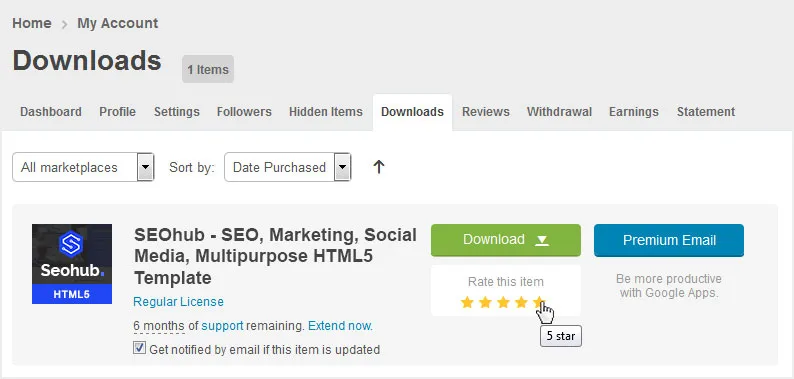
If you like our theme and support, please do not forget to rate it with 5 stars in your ‘downloads’ section and write a review in comments as it will add more value to our services!
Just click http://themeforest.net/downloads and you will see this template there. Hit 5 Stars to make us happy and we will make more awesome templates for you 🙂
變更日誌
Version 2.1
– 15 May 2018
- Added: SASS Files
Version 2.0
– 07 April 2018
- Added: Popper.js
- Updated: jQuery Library to Latest Version
- Updated: Bootstrap 3 to Bootstrap 4
- Updated: jQuery Bootstrap Select Plugin updated to support Bootstrap 4
Version 1.1
– 15 Sep 2017
- Fixed: Responsive container width spacing issue fixed in 320px screen
- Updated: Service list 01 page HTML structure update
- Updated: Home 2 and home 3 Revolution slider HTML code update
- Updated: Minor code/formatting improvements and fixes.
Version 1.0
– Initial Release
來源與鳴謝
All images and videos are for preview purposes only and are not included in the download files. Images are of copyrights under Creative Commons CC0.
Images
- Shutterstock Shutterstock
- Freepik Freepik
Video
- Dissolve Dissolve
Scripts
- Revolution Slider Premium Plugin
- Mega Menu Premium Plugin
- Jquery
- Owl Carousel 2
- Magnific Popup
- isotope
- Jquery appear
- 計數器
CSS & Fonts
- Bootstrap
- Font Awesome
- Google Fonts
- — Lato
- — Montserrat
中包含即可。 For questions on basic HTML, Javascript or CSS editing – please give your question a quick Google or visit W3Schools as template issues get top priority. You will need some knowledge of HTML/CSS to edit the template.